In 2012, a cantonal school in Enge had its students engage with open data as part of a course, and we at Opendata.ch were thrilled to report about it. Like at our hackathons, the students divided up into teams and asked questions through data, making hypotheses about youth violence, urban structures, tourism, labor costs, energy consumption and price levels. A central topic in their discussions was the access, availability and quality of open data.
We don’t hear about many projects like this, although I would be surprised if there is any gymnasium which does not have students using open data - and last year I was delighted to not only hear about another such project, but to even get a chance to participate with a small intervention. And so last August, André Golliez and I helped to introduce a room full of students from the Canton of Thurgau IT school in Frauenfeld (kanti-frauenfeld.ch) to the process of creating online visualizations and apps with open data used in our community.
Photo from OGD.tg.ch blog.
This was done for a pilot project run by staff of the new Open Government Data project of the canton - ogd.tg.ch - to encourage the students to familiarize and learn from these new data sources with expert support. More background can be found in German on the OGD.tg.ch blog, a Tagblatt article and other recent media releases.
Data pipelines
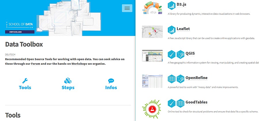
In an introductory presentation, I suggested ways to select open source tools for analysis and visualization of data through the lens of the School of Data Pipeline. We made toolbox.schoolofdata.ch in part to support this pilot project.
The resulting 6 student teams took on datasets similar in scope, as they were asked to focus either on environmental or tax data, but diverse in their approach and technical choices. While I’m not at liberty to share screenshots or any other outputs just yet, here is a summary of some of the frameworks they used to realise their ideas:
| Project | Die Ideale Gemeinde | Steuerfusskomperator Thurgau | Biomasse-Portal | Ideale Gemeinde | Steuerfusskomparator Thurgau | Naturgefahren |
| Bootstrap | 3.3.7 | 3.3.7 | 4.0.0 | 3.3.7 | 4.0.0 | 4.0.0 |
| jQuery | 1.12.4 | 3.2.1 | 3.2.1 | 3.2.1 | 3.2.1 | 3.2.1 |
| PHP | Y | Y | Y | Y | ||
| D3.js | 3.5.17 | 3.5.17 | 3.5.17 | |||
| Chart.js | 2.4.0 | 2.7.0 | ||||
| Popper.js | 1.12.9 | 1.12.9 | ||||
| jQuery DataTables | 1.10.16 | |||||
| TopoJSON | 1.6.27 | |||||
| Leaflet | 1.2.0 | 1.2.0 | ||||
| OpenLayers | 3.20.1 | |||||
| Mapbox GL | 0.42.1 | |||||
| Google Maps | Y | |||||
| FontAwesome | Y | |||||
| CreateJS | Y |
All the projects used maps, and it is interesting to see here all four of the best known web mapping libraries represented - Leaflet, OpenLayers, Mapbox/OSM, Google. Meanwhile D3.js, Chart.js and DataTables were used to render data. Twitter’s Bootstrap with good old jQuery is the choice starting point for all the projects, though the layouts could hardly have been more dissimilar. Some of the projects used PHP, and it would be interesting to see if they were just querying a database, or doing any remote service calls.
Most of these tools are essential in a good Web data visualisation toolbox. It would be good to add information here on which tools were used in converting, analysing and preparing data, as well as feedback about what worked well and any frustrations.
Thanks to the folks at the OGD office in Thurgau, especially Daniela Koller, Ulrike Baldenweg and Martin Barrucci, for the chance to participate in this exciting pilot, and heartfelt thanks to the students and faculty for applying themselves with outstanding results to the subject. I look forward to see more such experiments take place, hopefully forming into a regular program.
If your school is thinking about doing a project with OGD, let me know what you think the best support material or type of learning activities could be! We would be happy to support your needs.
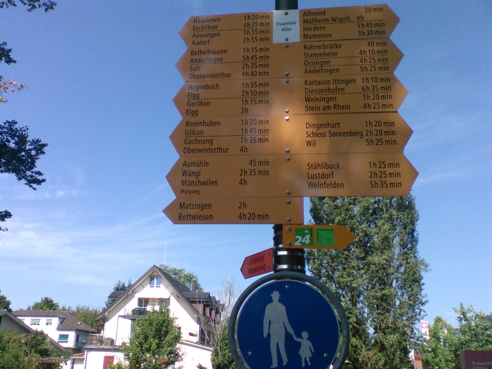
Photo taken by me in Frauenfeld on the first day of the project - CC BY 4.0


