As part of general financial revision, I wanted to have a look at my spending on public transport last year. I’ve been using the SBB’s mobile app with commitment, even for short distances.
The only thing I’ve been doing on paper are the multi-pass stamp cards which make travel on the town’s local network a little cheaper. They (Bernmobil) have recently made this possible through their own app, but since I take my bike into work in every weather anyway, this does not make a huge difference to my monthly expenses.
While the SBB has recently done a lovely makeover of the main web site, the Ticket Shop remains it’s same old ca. 2011 aesthetic. It’s the place to go to get digital receipts (with an inconvenient month time limit), and you can scroll back through your history of purchases.
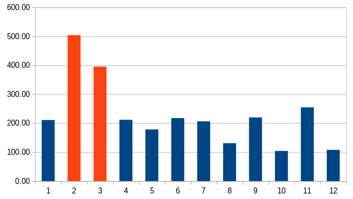
Anyway, it turns out that with a few lines of JavaScript and a quick pivot table in LibreCalc, you too can put together a graph like this one:
In orange, two busy months where I should have bought a monthly travelcard.
And in case you think we might be overpaying for our rail services here in Switzerland, have a look at the Prices & Earnings 2015 open data by UBS, which I hope they update this year - and the comparative analyses made possible by World Bank data.
