(This Markdown export from Jupyter is somewhat limited, see HTML version, or download the source for the optimal experience)
Here’s looking at you Git, data science style
This notebook is based on examples from GitPandas, a project to create handy wrappers for the GitPython library, in order to use Pandas data structures for analysing git repositories.
The basic use of this is to make GitHub-style pretty project graphs on your own processor time. It was prompted by a team working on a similar idea at Hackergarten Bern 3/2017, who used Python to parse the output of the git command, and I wanted to explore an alternative approach. Or at least just have some fun poking at Git:

Image © Jamie Hewlett via fabiola garcia
We begin with some basic initialisations. You might like to install Anaconda to set up an environment with something like:
conda create --name gitdatasci python=3 numpy pandas bokeh jupyter
…or use your own approach to set up the essential dependencies for this type of analysis. Then run:
pip install gitpandas
…and put a Git repository somewhere you can find on your filesystem, as you’ll see below. Finally:
jupyter notebook
…will open a web browser where you can make a notebook like this one - which you are free (as in beer) to download and reuse.
We start by loading the relevant modules:
import os
from gitpandas import ProjectDirectory, Repository
import numpy as np
from pandas import set_option
from bokeh.plotting import figure, output_notebook, show

set_option('display.max_rows', 500)
set_option('display.max_columns', 500)
set_option('display.width', 1000)

output_notebook() # are we happy?
Baby steps
Okay, now let’s grab a locally checked out git project - say, https://github.com/okfn/licenses.git which I’ve put in the parent folder. Create a basic repository object and do some basic checks.
path = os.path.abspath('../licenses')
p = ProjectDirectory(working_dir=path)
r = Repository(path)

# is it an empty repository? expect False

r.is_bare()
False
Data collection
Now let’s extract some useful information from that famous Git database. From the commit history, which we filter somewhat, we can get the git logs:
ignore_dirs = [
    'docs/*',
    'tests/*',
]

# gets a data frame in the format [ date, author, committer, message, lines, insertions, deletions, net(?) ]

ch = r.commit_history('HEAD', limit=None, include_globs=['*.py'], ignore_globs=ignore_dirs)
ch.head()
| author | committer | message | lines | insertions | deletions | net | |
|---|---|---|---|---|---|---|---|
| date | |||||||
| 2014-08-11 23:11:59 | Mike Linksvayer | Mike Linksvayer | minimally get deploy script working with renam... | 24 | 12 | 12 | 0 |
| 2014-04-12 16:56:23 | Rufus Pollock | Rufus Pollock | Merge branch 'master' into gh-pages\n | 67 | 40 | 27 | 13 |
| 2013-12-06 00:26:38 | Mike Linksvayer | Mike Linksvayer | Merge pull request #29 from enyst/gov\n\nUpdat... | 2 | 1 | 1 | 0 |
| 2013-12-05 23:56:13 | enyst | enyst | Re-deploy with the changes to gov licenses. (f... | 2 | 1 | 1 | 0 |
| 2013-12-04 16:47:37 | Mike Linksvayer | Mike Linksvayer | Merge pull request #26 from enyst/retired\n\nU... | 31 | 23 | 8 | 15 |
Data wrangling
Now let us start putting dots together. What do everyones contributions look like? For that we shall group by „committer“ (notice the duplicates).
attr = ch.reindex(columns=['committer', 'lines', 'insertions', 'deletions']).groupby(['committer'])
attr = attr.agg({
    'lines': np.sum,
    'insertions': np.sum,
    'deletions': np.sum
})
attr
| lines | insertions | deletions | |
|---|---|---|---|
| committer | |||
| David Read | 2 | 1 | 1 |
| Mike Linksvayer | 101 | 57 | 44 |
| Rufus Pollock | 1127 | 329 | 798 |
| david.read@okfn.org | 174 | 162 | 12 |
| dread | 9 | 6 | 3 |
| enyst | 79 | 46 | 33 |
| johnbywater | 334 | 253 | 81 |
| rgrp | 421 | 317 | 104 |
| ww@eu8.okfn.org | 4 | 2 | 2 |
| ww@styx.org | 97 | 91 | 6 |
Data visualisation
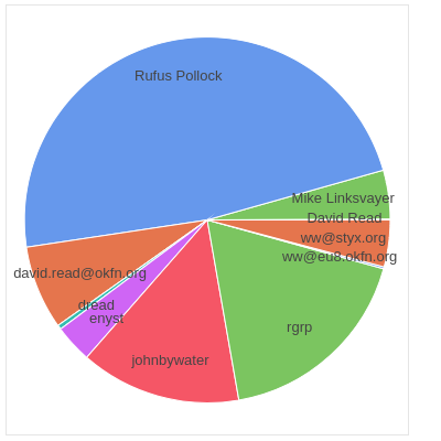
At this point, we can sort and visualise the committers in a simple Bokeh plot, made even simpler thanks to bkcharts (though it sounds like we could try something like Holoviews next).
from bkcharts import Donut

pie_chart = Donut(attr)
show(pie_chart)

Rock and roll.
Thanks for watching!
Now go listen to some music …

Image CC BY 2.0 Brad Barrish via Wikipedia