Since I find open data something valuable, and since I’m a User Experience Architect, I thought it might be useful to do a UX review of opendata.swiss: Was ein UX Review kann, am Beispiel von opdendata.swiss. The aim is both to show what the method can do, but also - hopefully - to contribute something useful.
The most important results are:
There seem to be quite a few data sets available, but there’s room for improvement when it comes to the choice of data sets, content, and information architecture.
The same goes for search and navigation mechanisms: Most of the essentials are there, but findability could be better.
User Research would help to improve things further.
Based on this, I also suggest a few concrete steps that could be taken from a UX perspective. If you are curious about the details, you’re very welcome to read the review. Meanwhile, I appreciate any feedback: If you have any questions about the method or the results, or if you’d like to suggest additional use cases, or if you disagree with any of this, I’d love to hear from you.
Thanks! Best,
Timo, you are doing our community a big favor by taking a critical look at one of the central services we use and contribute to, from an objective and intelligent standpoint as a data user. We too quickly get used to the quirks and habits of a tool or platform, and as advanced users have a very hard time seeing another perspective. Your report shares some terrific insights in a very accessible form.
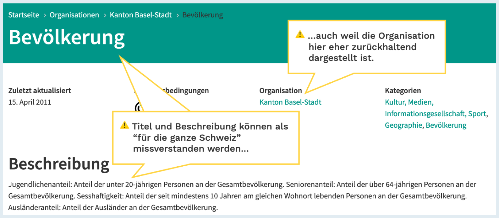
(An instructive screenshot from Timos report)
Secondly, I am aware of several UX design efforts that have been done as part of the project, and I think it would be very interesting - at least for historic reasons - to make sure those documents are archived, and linked to new efforts such as yours. This kind of open knowledge around the background of the project would be valuable also to organizations advocating and implementing OGD efforts, and if the documentation is open then it could also be improved upon. I suggest we petition for a chapter of OGD Handbook on this topic, at least some wireframes or style guides uploaded to the GitHub organization. The same goes for CKAN, which has design principles in particular governing the publication of data, that have been to some extent discarded in the integration of Wordpress and other CMS’s into the workflow at opendata.swiss. Your review and others to follow could then lead with and build on this existing documentation.
As I’m sure many in the UX community are aware, the instruments of A/B testing and page funnels are critical to the design of successful platforms, so by extension of the above I think it would be great to dive more into data about the patterns of open data users through the publication of analytical datasets like this one:
Finally, it would be quite important to state clearly if your work was paid for, or not. Currently, this is not obvious.
Thanks a lot, I hope that someone will be able to make use of it
I also think this would be good, not only for historical reasons: There are always reasons for why a platform has been designed in a certain way. These reasons and considerations often are lost. This makes it possible to repeat mistakes, and it makes it difficult to build something better.
I think adding such a “design history” chapter to the OGD Handbook, as I understand your suggestion, might be useful. Do you know of other concrete documents that should go in there, and how would we make this happen?
Absolutely. Website analytics data is always helpful for this, and it might be interesting to see that from opendata.swiss.
True. So far, this has been unpaid work, which I see as a service to the community.