Countless events including our Hackdays tomorrow are being cancelled as even more strict public health measures are being put in place in Switzerland, which is close to being in the top 10 of countries currently most affected by the novel coronavirus (COVID-19).
Earlier today we debated a question over Twitter about the lack of data and interactive visualizations on the topic from the authorities, the question being - who wants to help fix the situation? Poster @marcbrub suggested taking a look at what’s being done in Singapore, and while this level of detail is impressive, a lot of caution needs to be exercised these days - once we get past the fearmongering, mask hoarding, paranoia and fake news - to make sure that we don’t encourage overstepping the line in a way that we will regret later, as @ensoesie aptly tweets:
Having said all this, as we bunker in to weather out the viral storm, surely we’re all wondering: how long will this last? @dani_graf asked to see some epidemic curves to which there have been a couple of quick replies with data sources and tips. Here are a couple more:
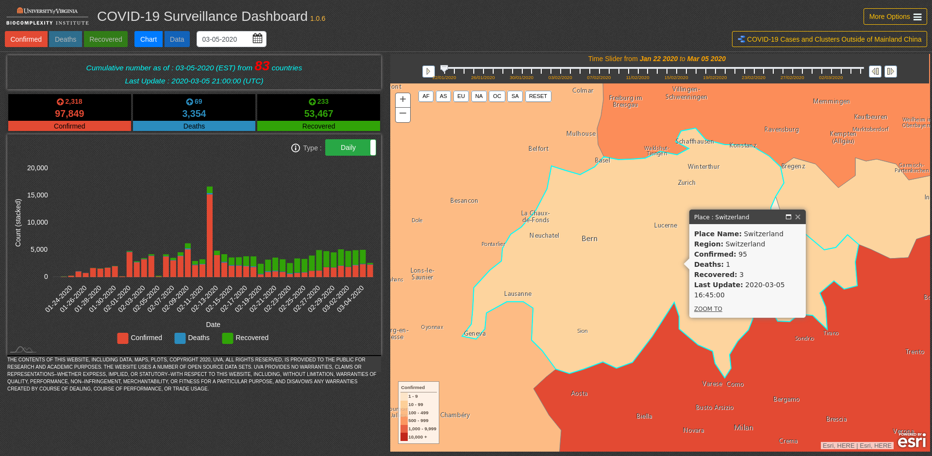
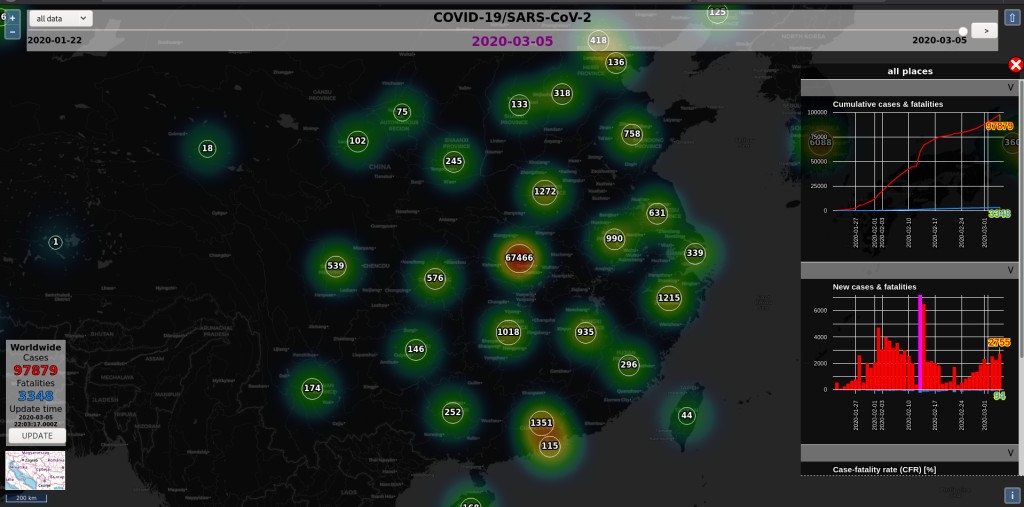
The interactive dashboard pictured above from the University of Virginia at http://ncov.bii.virginia.edu/dashboard/ (see user guide for a backgrounder on the data) has very usable interactive charts. There is also this visualization by Aleksandar Jovicic that, despite it’s dark mode flavour, lets you zoom in and check out the curves by region:
It would be nice to select several areas and compare their patterns. Meanwhile, the John Hopkins project is a reference for getting the data and visualization effort quickly organized.
So, Switzerland, let’s not waste time, do some armchair epidemology and crunch those numbers! Find a good intro to epi curves. Get some open data from past plagues, european (thanks @sylvain_gardel) or international data to practice on, and please post any tips or projects or new data sources as they become available.
I’d like to share an update of some inspiring work coming in over the weekend, in part from the open data community. If you just want to see some epi curves, skip to the next post.
But first, let’s get our terminology straight, as I was still confusing the terms above and am probably not the only one taxed by taxonomy here. The virus strain is called Severe acute respiratory syndrome coronavirus 2 (SARS-CoV-2). The wider issue is called the Coronavirus disease 2019 (COVID-19). There are now over 111 thousand documented cases worldwide.
Last week, my urban data team discussed the situation to see if there was anything valuable we could contribute: as I’m sure at least half the country was doing*. We figured the main questions we should try to resolve are:
Who is releasing trustworthy data?
Who is clearly not?
How to tell which sources are reliable?
Bonus questions would include:
How resilient is our public (digital/data) infrastructure to an epidemic?
What are all the kinds of health data we should be trying to open up?
What data are we risking of going too far with in a vulnerable state?
What kind of practical advice and (mis-)information strategies exist?
If you would like to collaborate on this kind of mission, let me know, as I am making appeals across several networks to help to coordinate a community response. In the meantime, here is what I have to go on:
An exceptional attention is being paid to data sharing and public health bottlenecks in our part of the world right now. Not everywhere, not always to the best effect, but hopefully we are moving in the right direction. And hope is a powerful four letter word. Some big lessons are being learned…
Nexstrain is using open data to track and predict infectious disease …[with] automated analysis pipelines [that] process openly available sequence data. … Intuitive and interpretable visualizations like nextstrain are key to turn data into actionable results that public health officials can build upon.
– Richard Neher at OpenCon Switzerland 2018
Let us be inspired by people who have been working hard for years to get data sharing platforms ready for handling this kind of scenario, and aim to be nearly as professional in our own fields!
Stay tuned for more epi curves …
(* in my imagination: the other quarter of the population grumbling about it all being overblown, another quarter panicking and quietly emptying the shops of rice and conserves, and a tiny sliver of us doing the really nasty kind of hoarding that you were seeing all over the net)
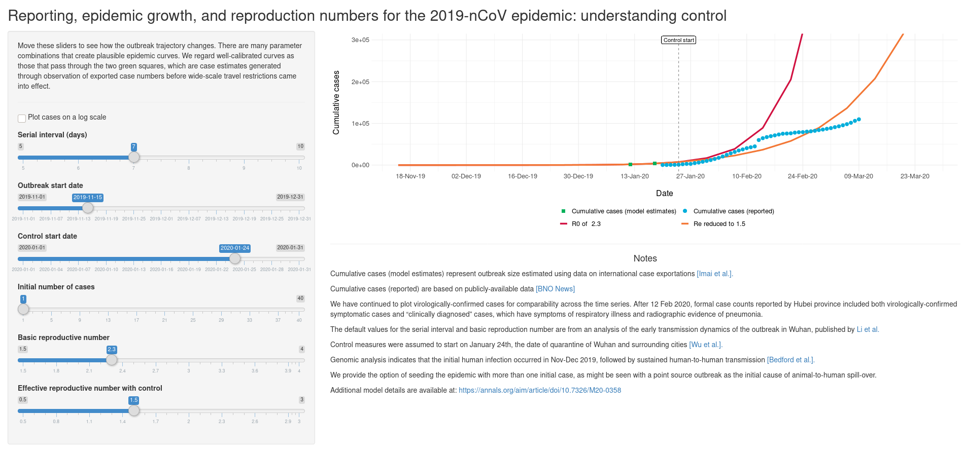
The Understanding Control interactive dashboard based on a model by A. Tuite and D. Fisman does a great job of letting us play with the numbers and get a more intuitive sense of disease dynamics.
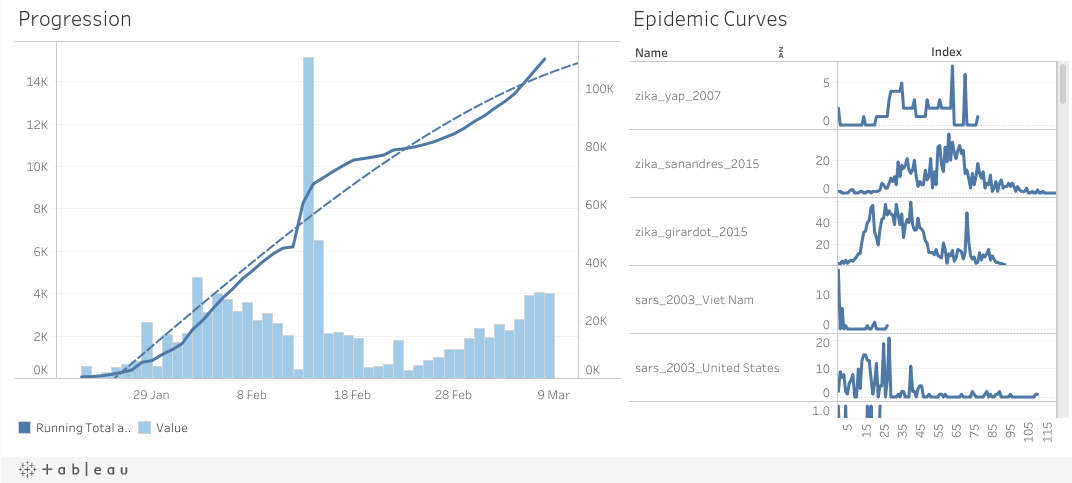
Meanwhile, Zuye Zheng’s Tableau excerpted above, plots current COVID-19 data next to historical epi curve profiles. It is quite a nice way to orient, though I would have like to have the ability to zoom and stretch the graphs (maybe I just don’t get the UI…) You can find the source code, helpful R package (some more are here), and data source linked. Neat!
Finally, to quickly jump into some visualizations yourself in JavaScript, I would suggest forking the nvoc2019-data or covid-19-derived-chart Observable notebooks, the latter pictured above, by Philippe Rivière as a starting point.
The societal impacts of the epidemic are now clearly going way beyond public health measures, as in every organization around us virtual alternatives are being encouraged. Knowledge workers are urged to stay at home, with many people defyingly and perhaps in some cases opportunistically commuting anyway. Students are being asked not to come to class and take their lessons online … which, by the way, means lots of great new online content, such as:
Liz and Haven put the main issues at stake this into two very succinct tweets:
Meanwhile, people hotly debate what is being done right or wrong in other countries:
I’ll be back shortly with more COVID-19 data visualization news. If you think this is useful but perhaps this forum thread is getting grassy, and have a suggestion of where else this could go, let me know.
I had coffee with a doctor this morning. I reached out to friends in troubled regions. We talked about H1N1 / H5N1 and SARS, what was learned then and what is being learned now. The role of the economy and its leadership, and what we can do from where we are inside a well organized, staffed and equipped health system. It is inspiring to see a silver lining in the united fronts going up. Stick to that and get past the devastation and abuse.
Always remember that there are always a lot of people out there who are much worse off than us, that when fingers are being pointed and blame assigned, it is the long term view that really pays off.
So let’s dig into the data. As of this morning the COVID-19 numbers from the Canton of Zurich are officially available, with notice that the data of the Swiss cantons and the federal government since March 9 is not comparable to the data of other countries. Since that day, not all suspicious cases are tested in Switzerland, but only those that meet certain criteria.
The Swiss government are working on publishing metadata which highlights this and other utility aspects in ways that could be most clearly understood. We can help them with our own observations, feedback and use cases.
With thanks to @julianschmidli, I want to make sure to add the topic of „doing more harm than good“, or as your doctor might say it Primum non nocere. There are several threads on Twitter debating how, why and what to visualize, including @lisacrost, @evanmpeck and @data_jackalope who posted long threads about things we should consider before digging into the COVID-19 data, with illustrative examples and counter-examples.
If I would try to summarize their key points:
We still have very early, misleading and unreliable data.
Exponential curves challenge our limited human perception, and peaks are not what they seem.
There is very little basis for comparison, no two epidemics run the same way.
Be ready to defend your work to: an infectious disease expert, someone affected by the disease, and a person with higher risk or in a more affected area.
Tell your audience exactly what level of objectivity they should expect.
Check out some further readings & resources, and let me know what I have missed.
Besides this, I am trying to stay calm and productive, which means turning off the news/twitter for a while, thanking (at least in my heart) our health workers, letting them do their job, staying cautious and positive. Washing hands and sanitizing surfaces while looking on the bright side of all we are learning and sharing today. Which reminds me…
Happy 31st birthday, Web! Thanks for all the HTML … and sorry a pandemic has come in to ruin your party. Thank you Web community, for empowering us to overcome COVID-19 with information, coordination and remote work options. Thank you WWW Foundation for helping us to not lose the bigger picture today.
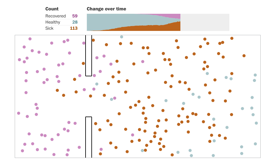
To better understand why we have to quickly adopt drastic measures of social distancing NOW, try the excellent simulator by Harry Stevens and team at the Washington Post:
“The restrictions in mobility, closure of public spaces and the enhancement of smart/remote working, led to an average reduction of potential encounters of 8% during week 2 and almost 19% during week 3.”
 epi curves. Get some open data from past plagues, european (thanks @sylvain_gardel) or international data to practice on, and please post any tips or projects or new data sources as they become available.

 … and sorry a pandemic has come in to ruin your party. Thank you Web community, for empowering us to overcome COVID-19 with information, coordination and remote work options. Thank you WWW Foundation for helping us to not lose the bigger picture today.